
Tips and techniques to improve the design and readability of your report, thesis, paper or other long document by Otto Coster
So, I’m currently at the point where I’m writing my master thesis. After having seen a lot of theses and other reports, I think most students have little idea how to give their work a professional layout that encourages the reader to actually read it. Most people stick to the default Word 2007 Calibri layout, which is not optimal for printed documents. I’m going to provide you with a few tips and techniques that you can use to pimp your documents.
Page layout
Depending on where you are in the world, your document is likely going to be printed on A4 or on Letter format. The problem with Word is that the default full page width settings are not very suitable for long, printed documents. Ever wondered why academic papers are always in set columns and don’t look like a Word document? Because they’re designed to be read in printed form.
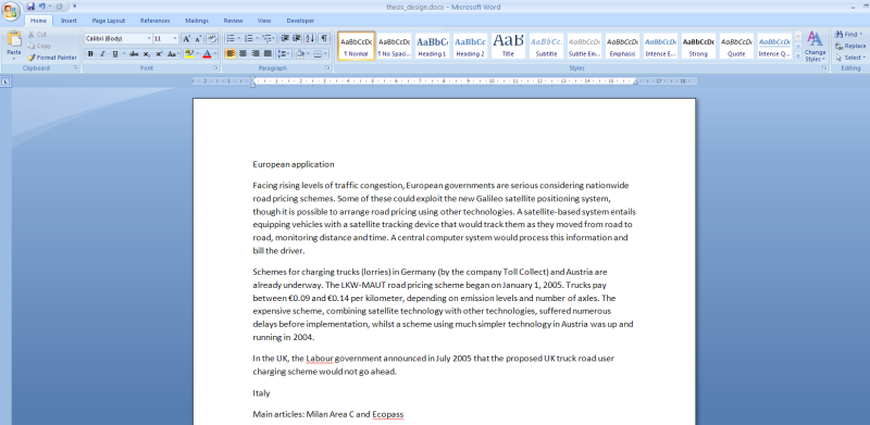
The default, full-width, Word 2007 Calibri look. It is too wide for long documents.
Line length and margins
First, some recommendations about line lenght (how many words / characters are on a single line). The default line length in Word is a bit too large. Optimal is about 12 words per line. The default of Word is more like 18 – 20 words per line. Line length depends on the size of your font and the page margins.
An optimal font size is around 10 / 11 points. You can go a point larger or smaller, depending on your font. Magazines and newspapers usually have a text size of 8 points, books and novels are around 10.
To get to the optimal line length of 12 words per line the next thing you have to do is adjust the page margins (this is the whitespace around your text). Word has a great option for this, the mirrored margins. You can find it under Page Layout -> Margins. Choose Custom Margins and increase the margins to suit your page. I suggest 4 cm for top and outside, and 3 cm for bottom and inside.

Page setup with mirrored margins
Columns
Word can work with columns, but my experience is that this makes editing really difficult and annoying, especially if you’re going to use column endings etc. My advice is if you want to work with columns, use InDesign or do it at the last stage of editing, when you are certain the content doesn’t change anymore.
Typography
Calibri, the default Word 2007 font, is designed for the screen and not so much for print. Its type is called sans-serif, a font without the fancy hooks and lines on the edges of the letters. Arial is another sans-serif font you might know. For printed documents, it’s better to use a serif font, such as Cambria, Georgia or even the classic Times New Roman. The best way to change the fonts is via the Styles panel (right-click on the style and choose modify):

Line height
You can also set the line height in the Styles panel, via the button Format -> Paragraph -> Line height. Choose the ‘Multiple’ or ‘Exact’ option. The optimal line height is usually around 1.3 times the font size. That means when you use a 10 points font size, the line height is 13 points. Strangely, if you choose the Multiple option and use 1.3, you don’t get a line height of 13 points in Word, but a bit more. So if you would like to use the Multiple option, it’s probably better to use 1.1 or 1.2. You can go for a little less or more depending on what looks best. The best way to find out is to print the same page a couple of times with different line heights and compare. The lines need a bit of space between them, but not so much that you have trouble finding the next line.

Setting the line height in Paragraph dialog

Different line heights: 10pt/10pt is too little, 10pt/13pt is perfect, 10pt/1.3 is too much.
Other fine fonts
If you want a more unique font I can suggest any of these:

Charis SIL (classic and stylish)

PT Serif (here in 10 point size with a 12 point line height)

Alegreya (a modern classic)
Font structure
You might think now that these all look the same, but used as paragraph text the small differences can change the entire look of your work. Generally, it is best to use one or two different fonts at maximum in your document. Cambria is very suitable for both headings and regular text, but you can also use Calibri or another sans-serif font for the headings.
Make the headings slightly larger than the paragraph text, this is to give structure to your document. Let the reader know what is the most important. So, if you’re using 11 points for the text, use 14 and 16 points for the headings and 24 points for the chapter title.
Spacing is also imporant. The larger your headings, the more spacing they need. Most headings profit from a bit of whitespace before and after them. You can also set this via the Styles panel. Right-click on the style and choose Modify -> Format -> Paragraph -> Spacing Before / After. Often, something like 10 points before and 6 after is sufficient to give your headings some room.
Lines, colors and accents
A simple way to add that extra touch to your document is to give some elements a little accent. This can be a text color for the headings or a subtle line below the headings (Not with the Underline button, but in the Border section of the Styles panel). Keep it subtle, a thin grey line below is enough.
Important is not to overdo it. One colour maximum and no combinations of bold, italic, colors and lines, unless you know what you’re doing.

Subtle use of color in the headings and tables
Header and footer
In the footer, you want to place the page number and maybe your name or other information. In the header, you can place the title of the section. This helps the reader to follow the structure of your document.
The cover page
To come up with a nice cover design is hard, so here is some inspiration from the internet.

Text inside a large shape, from Note & Point

Top half image, bottom half text, from Co.Design

Text in a large square with a background image, from Subtraction

Text and a large symbol

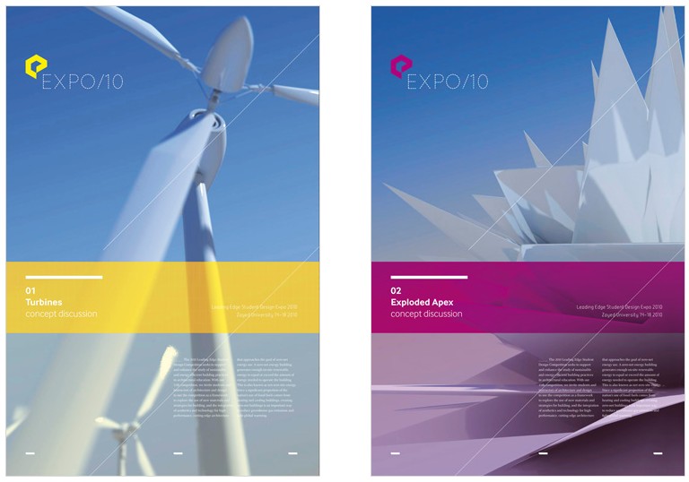
Image and ribbon

Text between lines
Background image and text in a horizontal semi-transparent block
Finally
At last, when you think your design is finished, print a couple of pages and look at the result. Fonts and sizes are very different on screen and on paper. Try to read a paragraph and check whether you can read the lines comfortably without losing track of where you are. Is it clear what the most important elements are on the page?
Some examples

Report of the Dutch government, with nice use of colors and different fonts.
TL;DR
- Use a easy-to-read font, about 10 points in size, for the paragraph text with a proper line height
- Increase the page margins so the line length is around 12 words per line
- Use different sizes for headings to provide visual structure
- Use lines and colors to add accents and interest to the page
- However, don’t use italics, bold, colors and lines all at the same time.
- Print your document and check the readability